


The 14th century Danse Macabre was a data story
And they did it without Powerpoint

The 14th century brought on the Black Plague, which eventually killed about half the European population. Some people saw that toll coming long ahead of time, and issued a warning — with a data story.
They did it without the benefit of today’s analytics tools and without even Powerpoint. They lacked the advice of Edward Tufte or Stephen Few. The terms “line chart” and “pie chart” were unknown. They had more effective tools than all that, tools that actually carried data within a story.
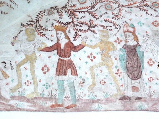
Their medium was imagery, such as in the Danish fresco from about 1350, shown here. It depicts a king and bishop dancing with figures representing death. The message: Everyone’s a candidate, even these elite people. The artful depictions connected, and people recognized the danger.
The depictions told an actual story. They didn’t show explicit beginnings, middles, and ends, one simplistic definition of story. A good storyteller knows the audience well enough to know what will be inferred and what needs to be spelled out. Nor was the story told with data charts lined up like tombstones.

A Datadoodle reader piped up not long ago to admonish me for comparing “data stories” to traditional stories. She wrote, “Data storytelling is different!” She never replied when I asked for elaboration; she must not have had data to back it up.
What are often called data stories these days are different in at least one way: Most of them are actually just data charts. They’re dead.
What so many would-be “data storytellers” seem to miss is this: A data story can include data, but the data just a supporting part. The main part is the human condition that’s reflected in the data. That can include the story that led to the data’s harvest, the story of the choices made in the data’s refinement, the choices made in the data’s analysis, and most of all the human meaning of the analysis.
A supposed “data story” consisting of just data, even when it’s lined up in pretty visualizations, is just data. In fact, by giving it the false label “story,” you undermine your message. And then your visualizations have all the life in them of tombstones.
Learn to tell a story. When you can make your data’s meaning connect on human terms with your audience, that’s when your data will come alive.
See the blog post that inspired this post at Howard Oakley’s always interesting weblog, Eclectic Light Company, where he goes deep into MacOS innards and fine paintings.